Wedding was great. Saw God’s glory and love displayed in such a beautiful way.

We didn’t get to go on our honeymoon because Steph got sick, but I’m honestly very excited to get back to markets and charting and write for y’all again 😅
Before we get into any charts, I want to share a few chapters of a book I’ve been reading (This Time is Different) to enhance your understanding of banking crises…


In our own words (somewhat paraphrasing)…
Say a bank borrowed funds from the United States government at a 1% interest rate. And now, interest rates are at 5%, and a lot of people want to withdraw money because they are panicking that their bank isn’t safe.
Now, the loans that the bank made for business and home owners have far longer maturities (meaning these business and home owners can take many years to pay the bank back at their locked in lower rates), so the bank simply cannot convert the loans they made out into cash on short notice.
Because the bank cannot pay people their money (you can read about the fractional reserve banking system here), the bank has 2 options…
- Roll their debt (that they borrowed from the U.S.) at higher interest rates.
- Sell other assets.
The first option means that the bank would actually lose money, since remember the loans that the banks made out to home and business owners were locked in at lower interest rates? Yep, the amount of income the bank is taking in from the interest of the loans they made for home and business owners will be much lower than what it needs to repay the U.S. government at higher rates.
And so, in order to prevent digging itself into an even bigger hole, the bank is left with the second option, which is to sell their assets at fire-sale prices. If many banks do this, then confidence in banking sector would continue to deteriorate and spiral down.
Right now, we are seeing all of this unfold in front of our eyes. More bank runs will continue to come, as confidence deteriorates, causing people to withdraw their money, and so on.
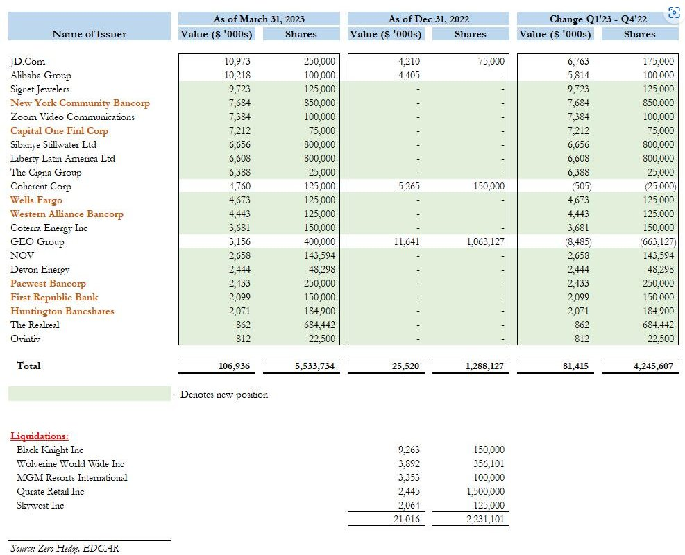
That said, Michael Burry has been buying regional banks…
Charts 1 to 14 – Looks Like a Bull Market?

The S&P 500 seems to be in a bull market, with the 30-week WMA sloping positive, and the 5-month, 9-month, and 20-month EMAs trending in bullish fashion.
Now, take a look at the monthly…
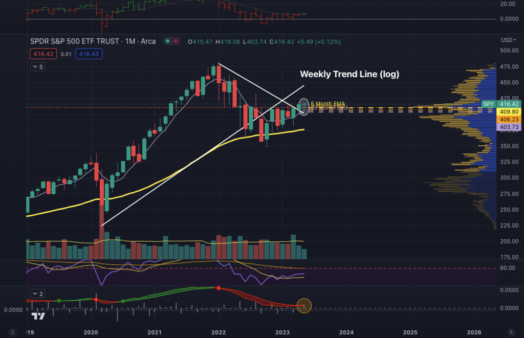
Even though the month of May has not ended yet, the hammer candle that I circled in white shows that even though the S&P 500 sold off from its opening price in the beginning of May, it got bought back up. Also, take a look at the price momentum oscillator about to turn green… (circled in orange).
The question that we may all be asking is… what’s going on?
A few things to consider–first of which is the debt ceiling…

The United States is running out of money and soon–by June, it seems–has to either raise the debt ceiling, or the country will default.
Tick tock–On May 15th of 2023 (this Monday), Treasury cash was depleted by $52B in one day to $87B…

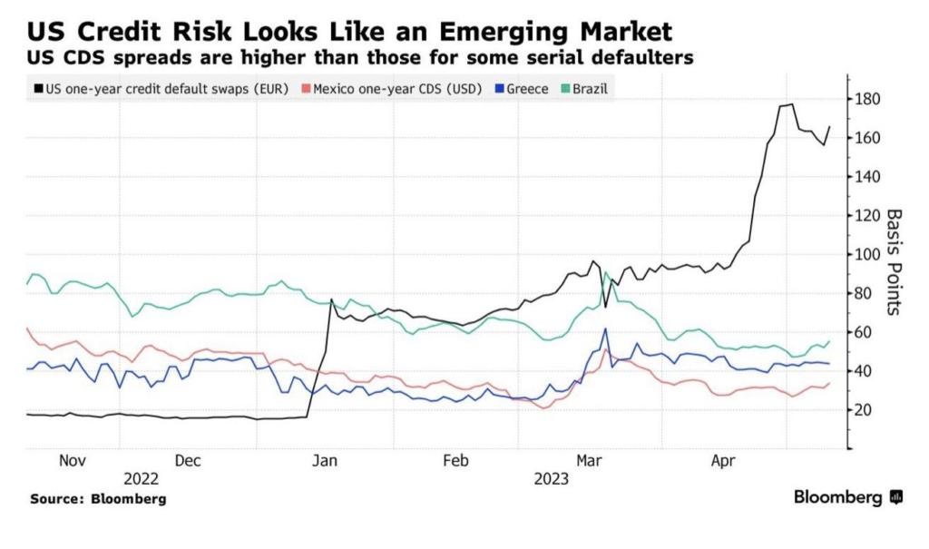
Fact is, the U.S. now has higher credit risk than Mexico, Greece, and Brazil…
The stock market is rallying perhaps because market participants believe that the U.S. won’t go down without a fight, meaning they believe that the U.S. will raise the debt ceiling and just print more money. It is hard to imagine a scenario in which the U.S. just goes down and defaults without a fight, unless if politicians are really that incompetent and selfish to do things according to their own personal gains and agendas.
If the U.S. does default, interest rates for Treasuries would definitely rise, as lending capital to the U.S. will be perceived as more risky, which would of course affect the U.S. government’s own interest payments and the cost of borrowing for businesses and households. In addition, payment for federal workers would be suspended, certain pension payments would get stalled, and interest payments on Treasuries would be delayed.
We don’t have any flows charts to back this up, but perhaps not only do market participants believe that the U.S. will raise the debt ceiling, but they may also be selling their Treasuries to invest in the stock market, since there may be less perceived risk in the S&P 500 at this current point in time. It’s impossible to say, but the other hypothesis we have is that after such significant inflation, maybe the current price of the S&P 500 denominated in dollars is actually worth just as much as the S&P 500 in 2019.
Take a look below at the S&P 500-to-gold ratio…

I’ve boxed 2019, before the money printer went “Brrr….” And it does appear that the S&P 500 relative to gold is at around the same level as in 2019. And so, when we consider how much the dollar has been debased, perhaps the S&P 500 isn’t so expensive.
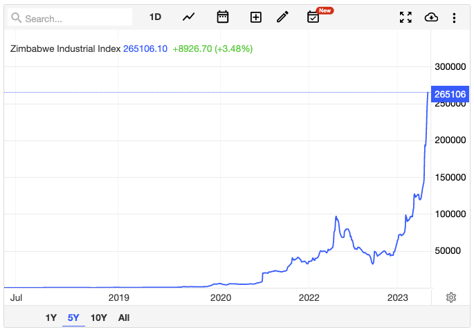
Remember Zimbabwe? They just keep printing and debasing their currency, and this is how the stock market reacted…
We will see what happens with the debt ceiling come June, but it is becoming more and more evident that the U.S. is gradually becoming an emerging country.
From LAT…

“Thanks to rising yields, the US government now has to spend more each year on servicing its immense debt burden than it spent on national defense in 2022.
Estimated annualized debt-servicing costs are about 90% higher than they were back in 2011. This is partially due to an exploding debt pile, but also due to a significant shift higher in US yields. In 2022, based on how the Treasury breaks down line items, the US government only spent more on social security ($1,244b) and health ($909b), with income security in line with today’s debt-servicing costs at $813b.”
Yikes! Also check this out from The Kobeissi Letter…
Debt-to-GDP Ratio, by Country:
- Japan: 225%
- Italy: 135%
- Singapore: 126%
- United States: 120%
- France: 98%
- Spain: 96%
- Bahrain: 93%
- Egypt: 90%
- United Kingdom: 81%
- India: 70%
- South Africa: 62%
- Germany: 60%
- China: 51%
- Turkey: 33%
- Russia: 13%
“There are now only 11 countries in the world with a higher Debt-to-GDP ratio than the US. Since 2008, the Debt-to-GDP ratio in the US doubled. The debt ceiling crisis in the US is a small concern compared to how quickly US debt levels are rising.“
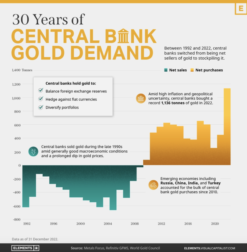
Of the countries above, Russia is in the best shape in terms of debt-to-GDP, and they also continue to accumulate gold…


Most recently…

Now, could the S&P 500 also be rallying just because AI stocks have been trending, and that right now is the safe haven? Possibly…
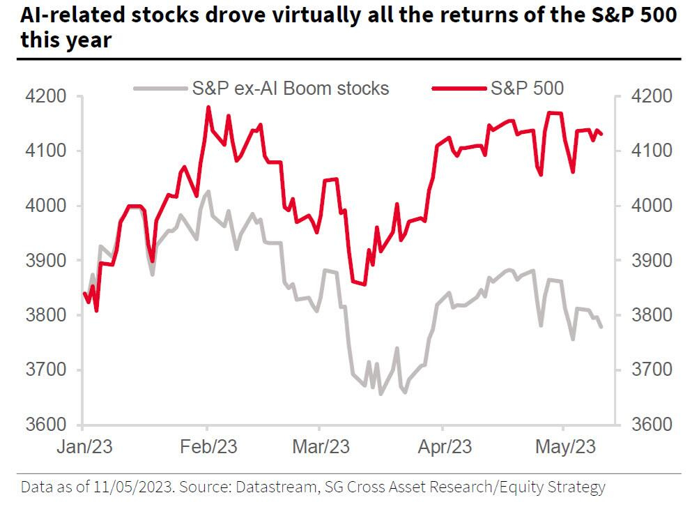
According to SocGen calculations, if you exclude the impact of the market’s AI hypetrain, the S&P would be down 2% instead of up 8%.
Meanwhile, the AI sentiment news indicator keeps rising exponentially…
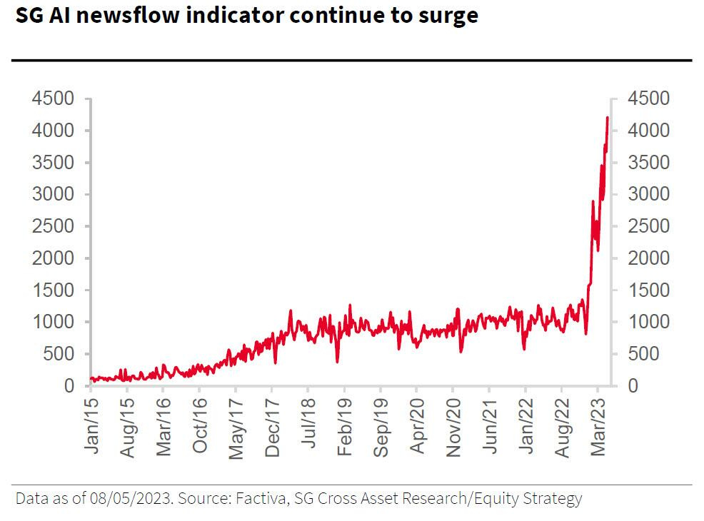
Could AI be another bubble in the making? The answer is a definite yes. We do believe that AI is here to stay, but like all assets and sectors, they all move in cycles. And so, while AI stocks may be on the rise, it is only a matter of time before they are met by some kind of trough.
Anyway, these are all just potential reasons we believe the S&P 500 may be rallying. Of course, it could be all these reasons + more reasons, but we are just presenting some of the data we’re seeing and the ideas in our heads.
Charts 15 to 21 – Commodities, Cyclical Bottoms, and Etc…
We keep harping on the same things (commodities…) but that’s because these mean reversion cycles take time–often two decades or longer for a full cycle to complete.
Just take a look at the troughs of the graph below…

At Alchemy of Investing, we use macro fundamentals to put a finger on where we are “in the grand scheme of things,” and then technicals to figure out intermediate-term cyclical bottoms because truth is, even in multi-decade cycles, there exists smaller cycles in all timeframes. And so, apart from knowing the multi-decade cycles, it helps to know where we are in multi-year and multi-month cycles, so we can position ourselves with the best prices.
I must admit that while I’ve known of this for years now, it does take living out a few of these intermediate-term cycles to really know and have the guts and wisdom to take advantage of cyclical bottoms. And right now, in the midst of liquidity contracting, it’s evident that we are once again seeing many sectors at cyclical bottoms.
Take a look below at Cathie Wood’s ARKK…
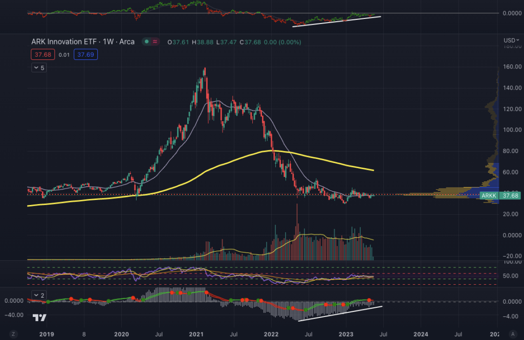
It’s pretty clear that it has bottomed, as weekly momentum structure has been steadily increasing and hovering just below the zero line. In addition, ARKK’s weekly Mansfield RSI has a positive slope and is now just below the zero line. Lastly, the 30-week WMA is flat and ARKK’s price is oscillating about that moving average.
These are all good signs of a cyclical bottom opportunity; however, the question is when will ARKK run again? At the end of the day, that’s all we really care about, isn’t it?
It’s impossible to say and most definitely a fool’s errand, as calling the length of any kind of bottom is as futile as calling the length of any kind of rally or top. We can likely position ourselves in ARKK right now, and just “try our luck” and sit on it for the next 3 years. Of course, our probability of making money with ARKK will not only be higher than back in 2021, we will also be taking less risk (by buying cheap) than if we had bought it back in 2021.
However, with interest rates much higher than before, it is hard to see a macro scenario in the next 3 years for ARKK to rally as it did in the past, as we just came out of the biggest asset bubble history with the lowest interest rate and liquidity injection history has ever seen, unless if they were to change their investment strategy. Therein lies the nuances of investing in certain cyclical bottoms and not others.
ARKK may just end up oscillating about the 30-week WMA and staying range bound for many many years, like Cisco after it got rekt in the dot-com bubble.

Even after more than 20 years, Cisco has failed to get back to its all-time high.
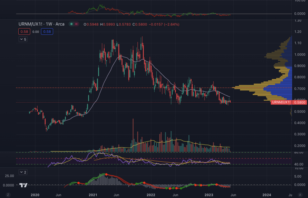
Now, I want you to take a look at Sprott Uranium Miners ETF (URNM)…

While I understand that since 2021, there’s been pretty much nothing but pain, something that is different here from ARKK is that since the March of 2020 lows, URNM has boasted a ~288% return and its chart is still holding strong, while ARKK only has a ~17% since its March of 2020 low.
Here’s another fact for you: From March of 2020 lows to its peak, ARKK boasted a ~372% return while URNM during its March of 2020 trough to peak boasted a ~545% return.
Of course, a ton of money can be made trading both stocks–and that’s the case for any stock, for that matter–but do you see how investing in the right sector at the right times matters so much when it comes to buying and holding?
And now, ARKK’s chart looks dead, while URNM looks like it’s just churning side to side before its next leg up.
Of course, we can’t tell the future, but URNM doesn’t look like it’s in a distribution zone (look below). In fact, URNM looks more like it’s in a re-accumulation zone, reading for its next leg up higher. And we can tell you that fundamentals certainly supports our hypothesis.

And guess what? Uranium mining stocks are still historically cheap when compared to the metal…
Full disclosure: We’ve been gradually scaling in and increasing our position in uranium equities during these times. Yes, we may face a hard landing ahead, and everything will be affected, but that’s why I am both deploying now, as well as have cash.
Now, we want to share something from Goehring & Rozencwajg…
“In our Q1 2021 commentary, we traced the 32-year operating history of Escondida, the world’s largest copper mine, using it as a prime example of the problems associated with depletion and the exponential rises in capital expenditures needed to mine lower and lower-grade ore. Our study ended with 2020 data, and it is instructive to update it for 2021 and 2022.
After completing Escondida’s massive 2017 $7 bn expansion, which increased sulfide milling capacity by almost 70%, copper production rebounded to 1.213 mm tonnes of copper from 770,000 tonnes produced in 2017. Rapidly falling head grades started eroding the mine’s ability to maintain copper production soon after.
By 2022, copper production had fallen by over 200,000 tonnes since 2018. Escondida processed ore with a head grade of almost 1.0% in 2018, but by 2022 it had fallen to 0.78% — a steep drop of over 20%. The head grade explains practically 100% of lost copper production over the last four years. And our analysis predicts the head grade will drop further.
In 2017, there were 5.35 bn tonnes of minable copper ore at Escondida, with an average grade of 0.65%. Today, there are 5.09 bn tonnes with an average grade of 0.56%. Escondida’s minable ore grade fell by 14% in just four years. In 2022, Escondida mined ore with a head grade of 0.78%, significantly above the reserve grade of 0.56%. Escondida mine managers continue to high grade, first mining their best remaining areas, leaving the poorer sections behind. This all but guarantees production disappointments from now on. Escondida’s operational and production shortfalls represent problems in other copper mines.
Head grades are just one issue bedeviling the industry today. Rising nationalism in a variety of countries is putting additional uncertainty over supply. In the last two years, populist governments in Chile, Peru, Bolivia, and Panama have all threatened and proposed significant increases in mining royalties and taxes.
The most recent and high-profile dispute emerged in Panama, home to the massive Cobre Panama mine (300,000 tonnes of annual production). The Panamanian government declared the 2018 mining law under which Cobre Panama operates to be unconstitutional. The government wants to hike the royalty rate eightfold from 2% to 16% and wants First Quantum (the owner-operator) to guarantee a minimum payment of $375 mm per year, regardless of production or profitability. First, Quantum has threatened to cease operations, and negations are ongoing. At this time, both sides remain far apart.
Civil unrest in Peru has now forced the closure of two large copper mines — Glencore’s Antapaccay and MMG’s Las Bombas. At 470,000 tonnes of combined copper production, these two mines represent about 2% of total world production. No one knows how long the unrest and blockades will continue. Peru has become a substantial copper producer over the last ten years, representing 9% of the world supply. What happens in Peru has an enormous impact on global production.
Copper demand is now running significantly above copper mine supply, further drawing down exchange inventories. Inventories are now at levels last seen in 2005, just before copper surged nearly three-fold.”
Now, something to note is that just last week, legendary investor Druckenmiller has communicated that…
“If we do get a hard landing, one would think that coming out of it, there are going to be some great commodities. Copper is in the tightest position I’ve ever studied. I’m actually afraid to have a meaningful position in it at this point as we approach a hard landing, only because I’m not an idiot and know what would happen to the cyclical factors as a hard landing starts. But coming out of it, given the move towards EVs, given the usefulness of it in infrastructure spending, which I think a lot of government policies will try to encourage on their way out. It’s hard to believe copper won’t be a huge beneficiary. The question is when I’m supposed to buy it, and how big the exposure.”
Do what you’d like with your capital, but we have cash ready and are already scaling in gradually from here, all the way to the potential hard landing and out of it. We want as big of a position as we can get in copper and uranium (and oil). In fact, I believe the portfolio of Goehring & Rozencwajg consists primarily of copper, oil, and uranium–around equal weighting in each sector.
And… we just might be releasing an investment thesis on a molybdenum company in the coming weeks as well. Due diligence is in the works but we are still researching.
All this said, I want you to check out the kind of returns we are after…
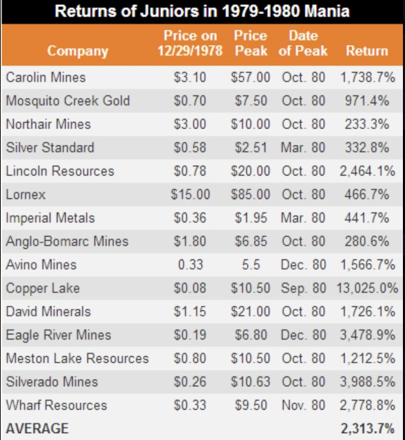

Notice how all sectoral manias tend to happen over a short span of time (1-2 years)?
In essence, that’s what we’re positioning for. We don’t care so much for years of underperformance or negative years, since as long as we know where the puck is today and where it’s going, all we really have to do is add to our positions, sit, and wait for the inevitable (the latter is often the hardest part!).
We may have to sit tight and wait for a few years for our stocks to experience “hockey stick growth,” but we definitely don’t want to miss out on those 1-2 mania years, even if it takes us, say, 8 years of underperformance. It takes the S&P 500 8 years to double your capital with a 9% annual return, with these kinds of investments, you may be waiting for 5 years with little to no action, until the mania finally comes in year 7 or 8 and net you the returns you see above.
Things will get crazy during mania years, and honestly, while we try to find mining companies with great fundamentals, a lot of mining-specific fundamentals like jurisdiction, management, and etc. won’t even really matter when people are rushing in to grab shares.
The macro fundamentals for commodities have never been better, as we have increasing geopolitical tension, currency crisis, out-of-control inflation, kinetic warfare. AND… as you can see from the first chart, commodities in relation to equities are still way undervalued and multiple standard deviations below the mean.
So yes, there may potentially be a hard landing, but there’s a chance that the U.S. prints their way out as they try to put up a fight. That said, even Druckenmiller acknowledged that he doesn’t really know the future. But what he does know is that should there be a hard landing, he will have the cash to deploy into attractive opportunities. We know that legendary investor Howard Marks of Oaktree Capital is cautiously fully invested, as he also acknowledges that he doesn’t know the future.
What we do here at AoI isn’t to call the future, but rather, we look at history, as well as what’s been building up and accumulating over the past couple of years to make bets about where sectors or industries are headed in the coming decade. And then we use technical analysis for good entries.
Charts 22 to 26 – There’s Always a Bull Market Somewhere (TABMS)…
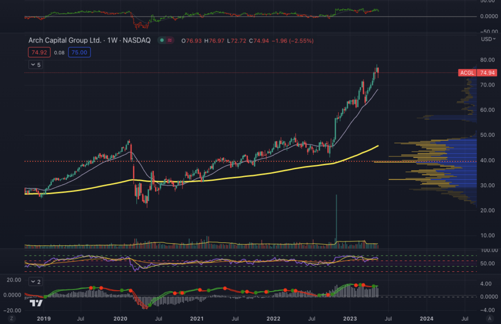
In this edition of TABMS, instead of sharing positively trending stocks, of which there are many, as you can peruse below…

We are going to look at a compelling demand zone stock…

Here’s a daily chart of MCF…
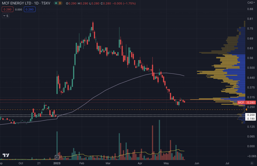
MCF Energy has a weekly demand zone between $0.19 and $0.23 (trace the dotted white lines to the first red candle) and a daily demand zone between $0.19 and $0.20, which means that when the stock rocketed higher back in the end of 2022, there was a bunch of unfilled buy orders, which caused the stock price to shoot ~2.5x higher (from $0.19 during that week’s close).
If a demand zone were strong, then usually, what happens is the stock price will dip into that zone and immediately get bought back up. Also, sometimes, the stock prices never dips into the demand zone, and it just keeps getting bought back up, so that is a possibility as well.
The lowest risk way to play this is to set some limits within the demand zone (at $0.23 and $0.20, in case the weekly demand zone upper bound at $0.23 doesn’t trigger buy orders, your next best bet is to look at the daily chart and go for the daily demand zone upper bound at $0.20).
After your limit orders hit, see if the price pops out of that zone quickly over the next few days or potentially next week (since we are using the weekly chart for the demand zone, notice how we say days (plural) and week (singular).
If you are really afraid and want to mitigate your risk as much as possible and potentially even missing out on the trade, you can just use the daily demand zone of $0.19 and $0.20 as your target. Your risk-reward ratio would be much better; however, there is also a greater possibility of your limit order never getting filled in the first place.
PS – Some Scripture…
Disclaimer
The information contained in this publication is not intended to constitute legal, accounting, or tax advice or individually-tailored investment advice and is not designed to meet your personal financial situation. The investments discussed in this publication may not be suitable for you. You are required to conduct your own due diligence, analyses, draw your own conclusions, and make your own investment decisions. Any areas concerning legal , accounting, or tax advice or individually-tailored investment advice should be referred to lawyers, accountants, tax advisors, investment advisers, or other professionals registered or otherwise authorized to provide such advice.
This publication makes no recommendations whatsoever regarding buying, selling, or holding a specified security, a class of securities, or the securities of a class of issuers, and is for educational purposes only.
This publication is not, and under no circumstances should be construed as, a solicitation to act as a securities dealer or adviser. The opinions expressed in the publication are those of the publisher and are subject to change without notice. The information in the publication may become outdated and there is no obligation to update any such information. Past performance is not a guide to future performance, future returns are not guaranteed, and a loss of original capital may occur.
TO THE FULL EXTENT PERMITTED BY LAW NEITHER, ALCHEMY OF INVESTING NOR CABBAGE CAPITAL LLC, NOR ANY OTHER PERSON OR COMPANY, ACCEPTS ANY LIABILITY WHATSOEVER FOR ANY DIRECT, INDIRECT, OR CONSEQUENTIAL LOSS ARISING FROM, OR IN CONNECTION WITH, ANY USE OF THIS PUBLICATION OR THE INFORMATION CONTAINED HEREIN. ALCHEMY OF INVESTING AND CABBAGE CAPITAL LLC EXPRESSLY DISCLAIM ANY GUARANTEES, INCLUDING, BUT NOT LIMITED TO, FUTURE PERFORMANCE OR RETURNS.
No part of this publication or its contents, may be copied, downloaded, stored in a retrieval system, further transmitted, or otherwise reproduced, stored, disseminated, transferred, or used, in any form or by any means, except as permitted with prior written permission.
This publication is proprietary and limited to the sole use of Alchemy of Investing subscribers. Please do NOT post this on any website, forward it, or make copies (print or electronic) for anyone else. Each reproduction of any part of this publication or its contents must contain notice of our copyright. Any unauthorized downloading, re-transmission, or other copying, modification or use of the Trademarks, this publication or any of this publication’s contents may be a violation of statutory or common law rights which could subject the violator to legal action.
There is a risk in trading markets. We are not registered investment advisers. Do your own due diligence.